
Overview
FlexHub includes the reports below:Analytics Roll-Up
Review all your accounts’ and web properties’ integrated web analytics data in the Analytics Roll-Up report. Choose the accounts and web properties you want to report on to see a more holistic view of your sites’ key metrics.- Select the Accounts, Web Properties, Page Groups, and Metrics you want to report on and see the change over time
- See the web property with the largest gain and largest loss
- See the total change in metric performance.
Analytics Volatility Roll-Up
Quickly identify the locations across the world where you are gaining or losing on the metrics you care about. Discover regions that are gaining or losing to identify where action may need to be taken.City vs. City Rank Comparison
This report lets you compare keyword performance across any two cities you track keywords in with Conductor. Where the scatter plot skews heavily to one side or the other, you can infer that one city ranks significantly better than the other. You can use this visual chart to quickly find discrepancies to address and local strategies to optimize. Look for points on this scatter plot that deviate from the center line: these represent keywords for which your content has significantly different ranks across the two locations you are comparing. Use this information to find opportunities to improve your content localization. You can choose to compare any two cities and filter by device type. Hover over a point in the scatter plot to see the keyword and the rank in each location.\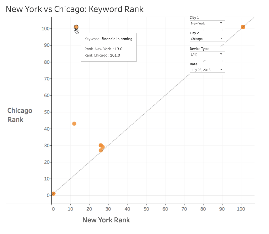
Desktop vs. Mobile Rank Distribution
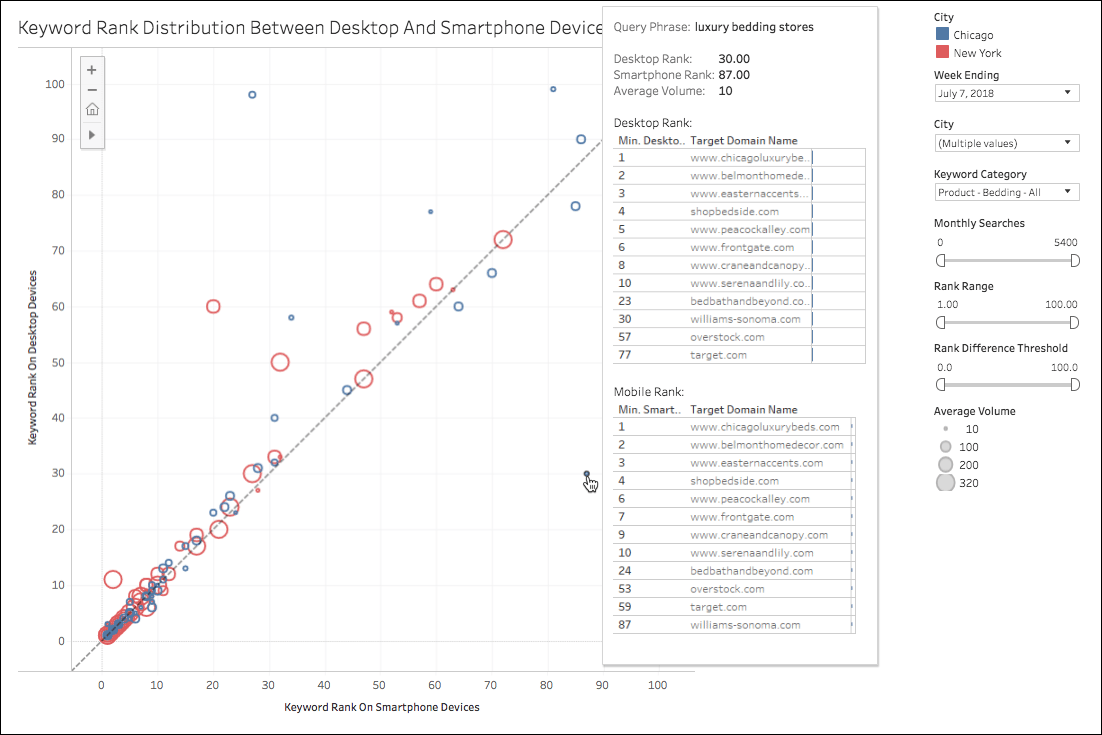
This report lets you compare city-level rankings between desktop and mobile devices. Quickly determine whether your mobile content is lagging behind your desktop to accommodate your audience and Google’s mobile-first index. You can use this report to identify where your ranks on smartphone differ significantly from your desktop ranks. You can use this information to learn where your content should be optimized for mobile devices. Look for points on this scatter plot that deviate the most from the center line: These represent the keywords for which your mobile and desktop ranks have the most different ranks. The size of these points reflects the relative monthly search volume of the keyword. You can filter this scatter plot to show data for specific:- Cities
- Keyword group
- Monthly search volumes
- Ranges in rank differences between desktop and mobile devices
Global Visibility Roll-Up
Quickly identify the locations across the world where you are most visible and where you can improve. Then simply click to jump into the Keywords report to see which searches are driving your visibility in those locations. You can investigate your tracked locations across the globe to see rank data split across visibility zones. Each zone is represented by a different color. The more ranking keywords you have, the larger the location appears on the map. You can filter this report by a number of dimensions including:- Location
- Rank Source (search engine)
- Keyword Group
- Device Type
- Result Type
- Rank Type
Search Console Analytics Roll-Up
Review all your accounts’ and web properties’ integrated Google Search Console data in the GSC Report Roll-Up. Choose the accounts and web properties you want to report on to see a more holistic view of your sites’ impressions, clicks, and click through rates. Just like the report in Conductor, you can filter and refine this data by a number of different dimensions, including device type and location. Additionally, this roll-up report includes page-level data, which does not appear in the Search Console Analytics report. This report includes four views:- Keywords
- Pages
- Countries
- Devices
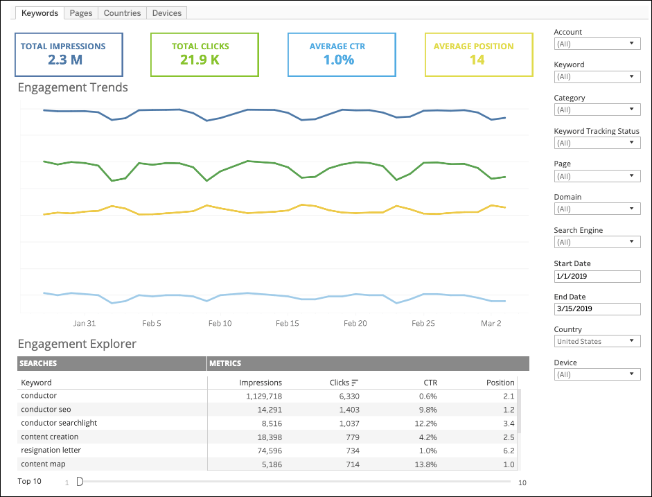
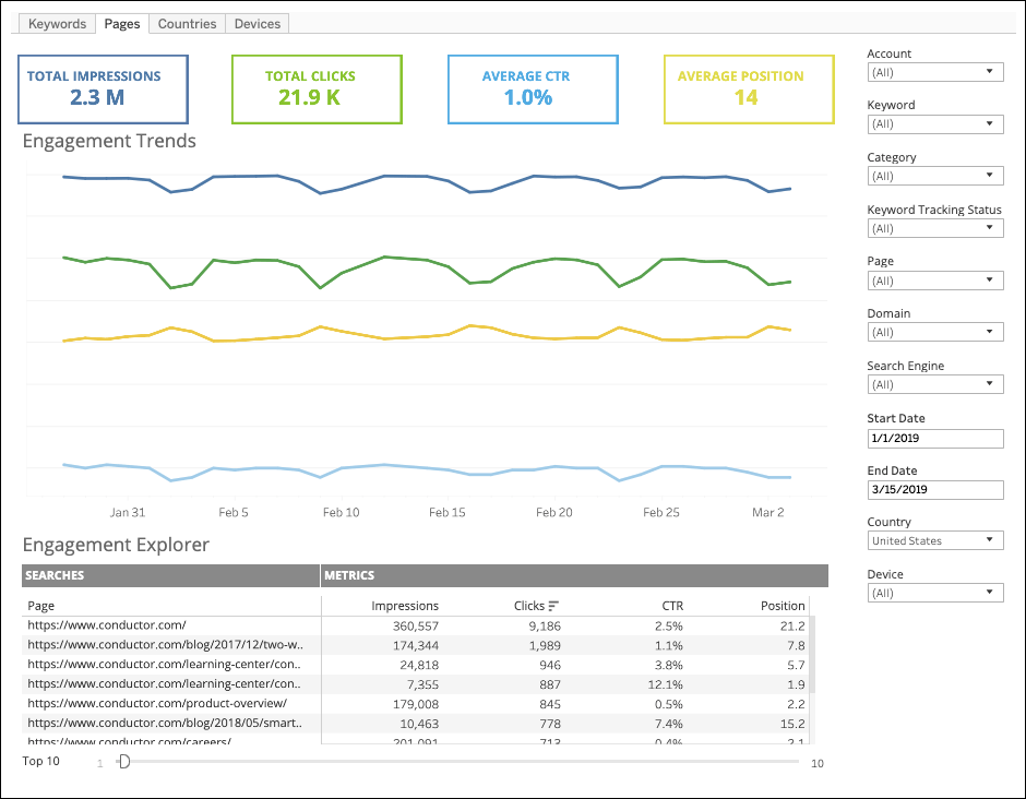
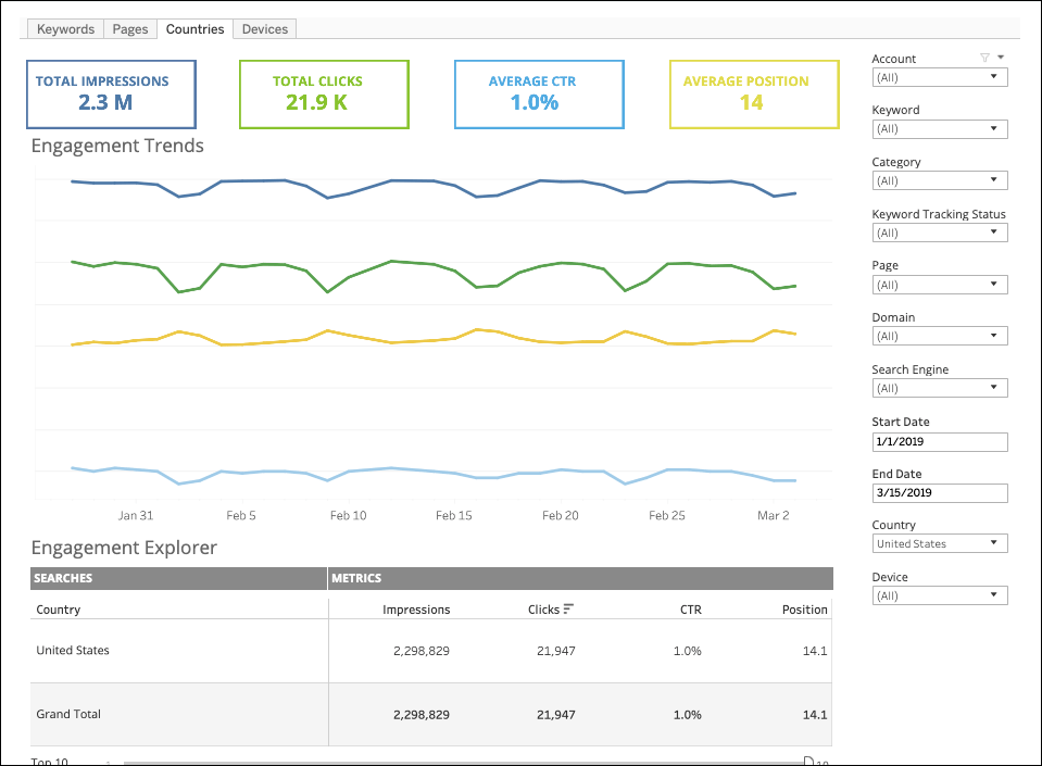
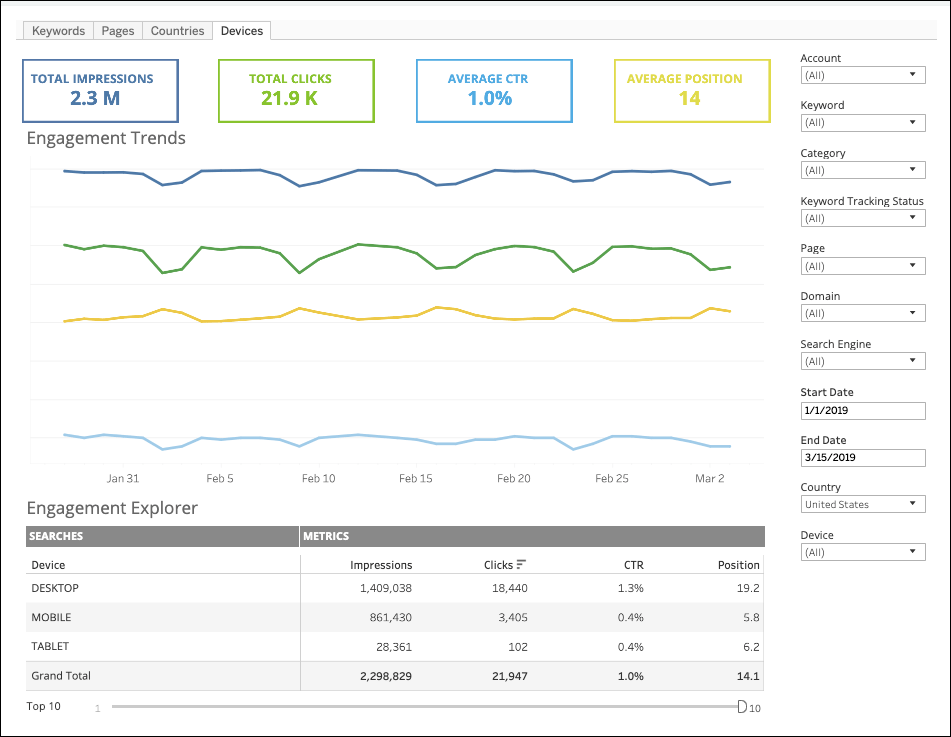
Keyword Group Search Volume Trended
See how interest changes over time for groups of keywords you care about. Select the Locations you want to report on and the keyword groups you care about to compare how the aggregated monthly search volume changes over time.Market Share Roll-Up
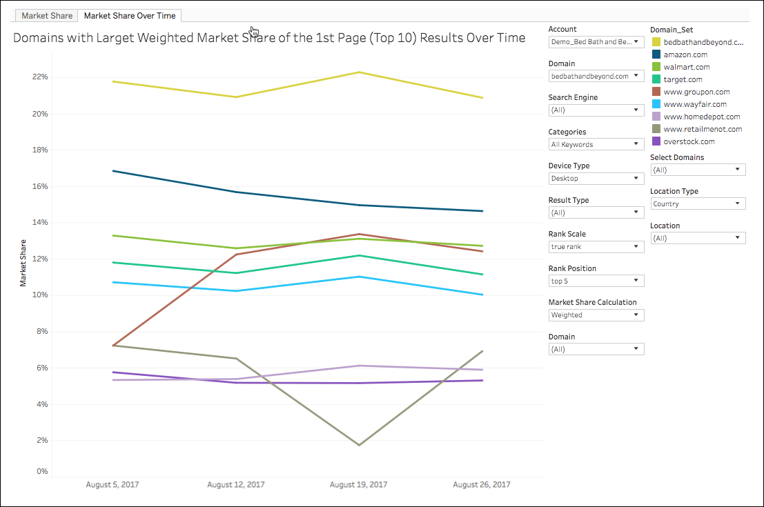
Review all of your accounts’ or web property’s market share data in the Market Share Roll-Up report. Choose the accounts or web properties you want to report on to see how much real estate you’ve earned in the top positions on the SERPs compared to your competitors. Just like the report in Conductor, you can slice and dice this data by a number of different dimensions, including location, device type, and result type. This report includes two views: Market Share and Market Share Over Time. Market Share This view shows a pie chart of your market share for the keywords you choose to report on with the controls on the right. Define your parameters and filter the report to include only the data that you are interested in.\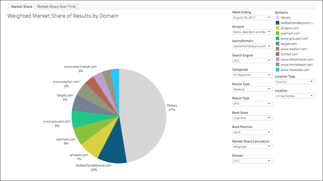
Page Group Comparison
Get a holistic view of the keywords that are driving traffic to your page groups.- Understand which page groups are gaining or losing on the number of keywords they rank for.
- See a Visibility Distribution chart for the keywords your page groups rank for.
- See the number of keywords your page groups rank for in designated visibility zones, trended over time.
Rank Volatility
Quickly identify the locations across the world where you are gaining or losing positions on search engine results pages, alongside the related modeled traffic for the pages ranking for those keywords. Discover geographic regions that are gaining or losing visibility on the search engine results pages to identify where you might need to take action.Result Type Distribution
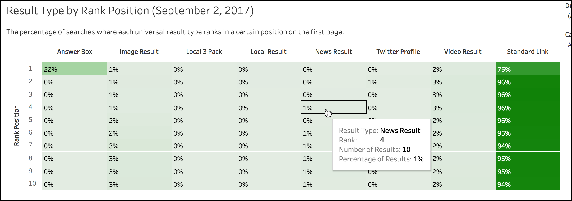
The Result Type Roll-Up FlexHub report gives you a holistic view of the result types that appear for the keywords you care about. With data from all of the content in your account, you can review high-level roll-up data to see the big picture at-a-glance. Then, use the filters to slice and dice the data to narrow your investigation down to the web properties, result types, and other dimensions you want to focus on. View the result types appearing on the first page for your tracked keywords To quickly compare result type performance over time and across result type, the Result Types on 1st Page Over Time bar chart shows you month-to-month changes in the universal result types that appear for your tracked keywords. Click on items in the chart to jump to the Result Types report and see the relevant underlying data.\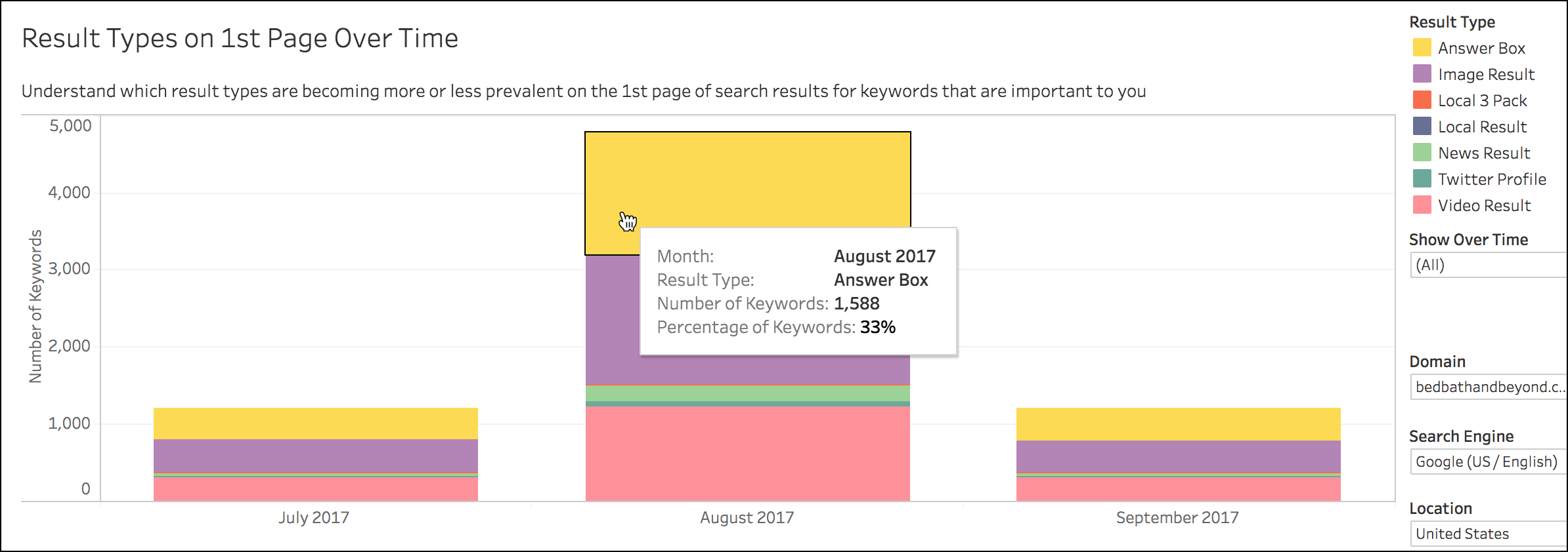
- Result Type
- Domain (Web Property)
- Search Engine
- Location
- Device Type
- Keyword group
Seasonality Roll-Up
Identify trends in demand for keywords and groups of keywords. By identifying spikes and dips in demand for topics, you can better understand when keywords are most relevant and help prioritize a content calendar.- See individual keywords’ search volume over time to help identify which months out of the year each keyword has spikes and dips in search interest.
- See individual keywords’ search volume over time grouped by season to help identify which seasons have spikes and dips in search interest.
- See keyword groups’ search volume aggregated over time to help identify which months out of the year a topic has spikes and dips in search interest.
- See keyword groups’ search volume aggregated over time by season to help identify which seasons a topic has spikes and dips in search interest.
Universal Result Performance
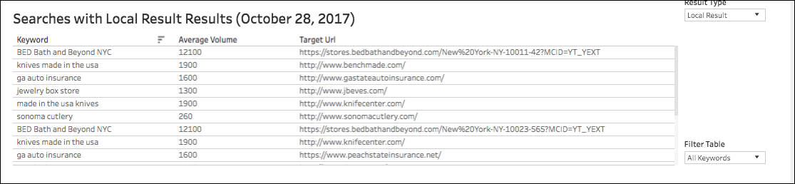
See loads of data about how your site performs for specific result types on the SERPs. Choose from any universal result types that Conductor reports on and see where you have new or lost results and find out where Google now includes a new universal result type where they didn’t before. Use this information to stay ahead of the competition for those results. First, from the controls on the right, choose the web property, search engine, and result type you want to report on. Review the bar chart at the top of the report to see how many results for a particular result type you own versus everyone else. Click a section in the chart to jump to the Keywords report to learn more about the underlying keyword data.\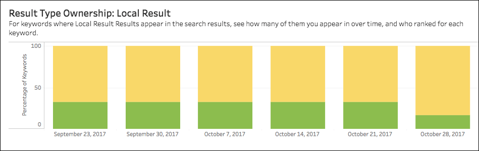
Visibility Distribution Roll-Up
You can see an at-a-glance view of all of your accounts’ keyword search performance in the Visibility Distribution Roll-Up report. Segmented into different visibility zones, this data is the account-level version of what you find at the on the Keywords report. Choose which web properties and accounts you want to see data for to focus on only those areas you want to report on. There are two views in this report: Distribution of Your Search Ranks by Zone If you have multiple web properties tracked in your account, you can use this view to see your aggregate visibility distribution for all of your account’s content. You can click a section in the bar chart to jump to the Keywords report to see the underlying data.\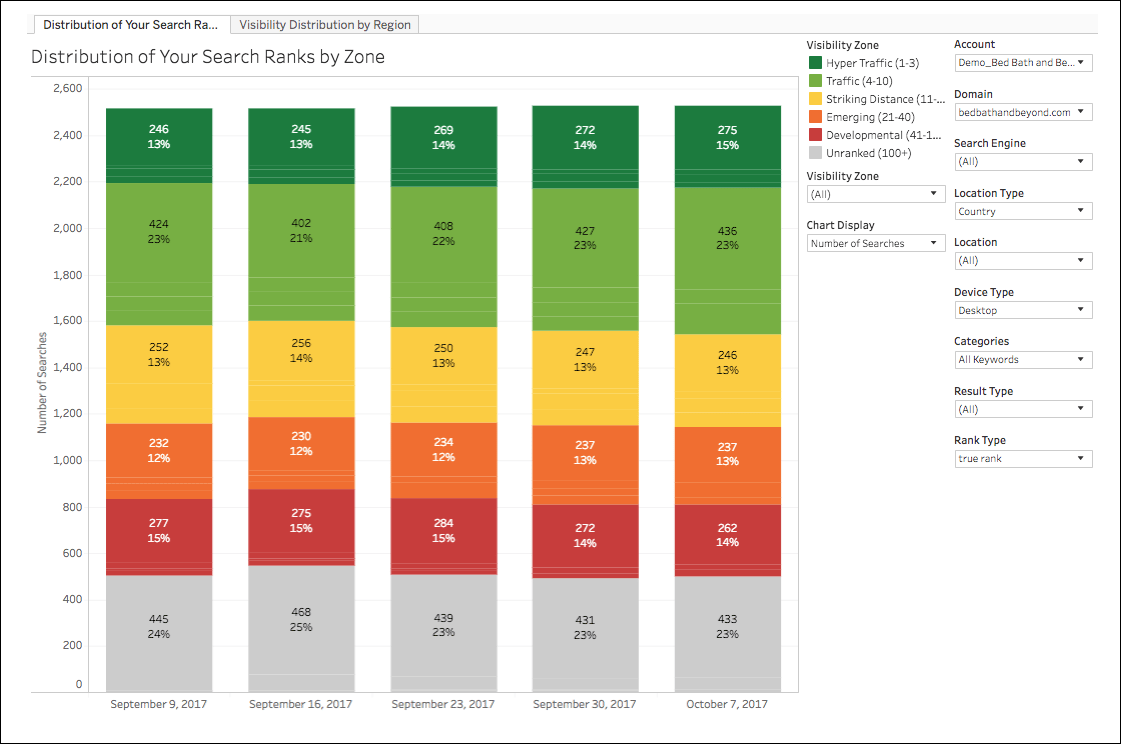
- Visibility zone
- Account
- Domain (Web Property)
- Search engine
- Location
- Device type
- Keyword Group
- Result type
- Rank type

- Visibility zone
- Domain (Web Property)
- Search engine
- Keyword Group
- Device type
- Result type
- Rank type
- Locations to compare